
Self-portrait I, acrylic, charcoal, water-soluble oil on paper, 14x11 inches
The painting above was a smallish, fairly quick (3-4 hours) test painting just to see what gold would look like in a painting. I'd been interested in using gold leaf, but wasn't sure if I could use the gold without it looking garish or as though it didn't belong. A brush was used only for the under painting. The primary image was done entirely with a palette knife, which made my painting style much looser than it had been before.

Self-portrait II, acrylic and water-soluble oil on paper, 11x14 inches
Above, another small, quick-ish painting to work on palette knife-handling skills. This one is less loose in spots than the previous one, but on the whole, I think it works. Almost all of my paintings are from photos, but I'm fairly sure this one was from life, hence the annoyed expression.

Rumination on Disintegration in a Small Space, acrylic, metallic powder, water-soluble oil on canvas, 48x36 inches
Rumination... is the first large painting I created using metallic powder. I'd been interested in using gold leaf, but opted for a less expensive gold-colored metal powder to see what could be done with it.
My initial interest in using gold stemmed from the idea that gold represents immortality or the everlasting, since it doesn't tarnish. My other initial color choices were based on information I found during my research that talked about a specific color of deep red, historically used with gold leaf. I wasn't trying to copy the exact color, it was just a nod to the tradition.
Conceptually, I was loosely focusing on emotions related to change, the places our minds occupy in-between major life decisions, and the identities we assume in these moments. I think though, that my paintings, whether I realize it at the time or not, are often primarily about how I'm feeling when I'm painting them.
This painting was made by putting acrylic gel medium down on a gessoed canvas, spreading quinacridone crimson acrylic paint over that, and then sprinkling gold-colored metallic powder over the top and brushing it lightly to smooth the powder (with a respirator on, of course), all before it dried. Brushing over the powder sometimes lifted a "skin" of paint off, leaving darker spots. Then, I took various implements and scratched back into the paint and powder mixture while it was still wet. After the acrylic mixture dried, I painted over it in water soluble oils with a palette knife. I'd intended to allow the underpainting to show through for darker values in some of the figure and that was successful. This is my favorite large painting of the series.

Relic, acrylic,
metallic powder, and water-soluble oil on canvas, 48x36 inches


Conceptually, as in the previous painting, Lost...II addresses the idea of emotions and identities in flux during change.
Relic was made in the same way as the previous painting, using only a palette knife for the figure. Conceptually, I was thinking about leaving something behind and trying to be open to new challenges, while feeling a bit irrelevant...maybe a reflection of my anxiety about painting in such a different way. I'm still debating about whether to paint something into the white space.

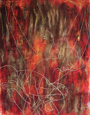
Lost in Transition I, acrylic, metallic powder, water-soluble oil, and ink on canvas, 48x36 inches
Lost...I was an exercise in switching gears again, although the underpainting was handled the same as the previous two.
Conceptually, Lost...I addresses the idea of emotions and identities in flux during change.
I'd been trying to think of a way to continue in the same vein with a figure or figures without becoming repetitious. I think slowly. I'm capable of coming up with good ideas, but they rarely come quickly. The original idea for this one was sparked by a double exposed photograph I ran across that I'd taken ages ago. It occurred to me that I might be able to do something similar in a painting. I took the reference photos, did a whole lot of Photoshoppin' to get a good composition, and soon realized that I didn't have time left to paint the bodies of the figures, so I opted for line work. Once I began the line work, I worked fairly intuitively and disregarded the previous plan, completely.
I think the line work was more effective than fully painting the figures would have been in this case, because of the overlapping of the bodies. This is probably my favorite of the paintings that have line work in this series. The only thing that bothered me was the oil painted area (which is actually a dark green, rather than black). It seemed a bit overwhelming at the time.

Lost In Transition II, acrylic and metallic powder on canvas, 48x36 inches
During a critique of the previous painting, I was cautioned not to let my figures look like E.Ts. I got a little paranoid about that, so in Lost...II, I gave the figures hair, but I think that took something significant away from the painting. I was also encouraged during the critique of Lost...I to incise lines into the paint rather than ink them, so I did this in Lost...II. Incising the lines took a lot of time and effort, and required me to alter the way I'd been painting.
For this painting, I laid down an even layer of medium over the entire canvas and let it dry. Then I laid down a layer of paint, incised the lines into the wet paint, then put more paint and medium on top, added metallic powder on top of that, brushed the powder and incised the lines again before the the last three layers began to dry. Easier said than done. I omitted the oils entirely. Because I was working so quickly and because of the incised line placement, the gold powder went on in small streaks this time. I used other transparent red and orange colors in this one to try to get more variation.

Lost in Transition III, acrylic and metallic powder on canvas, 48x36 inches
The ideas in Lost...III were the same as those in the two previous paintings. Lost...III was identical stylistically identical to Lost...II. There were some small variations in technique from the last one to this one, and in this painting, I used even more lighter, transparent paint to try to make the layers more visible. There are small areas of transparency in this painting that I like just because of variations in the paint.
Color choices (all transparent reds,
oranges and yellows) for the paintings after the first 3 were the result of the realization that all paint
colors did not react the same as the q. crimson with the metallic powder....something
about the chemical make up, apparently.
I enjoyed painting with the palette knife for awhile. I'll probably do it again. I liked the different effects I was able to create with various layers of paint and other materials. I'm still thinking about using gold leaf in a painting or paintings, but I'll definitely need to do some tests, first.
I enjoyed painting with the palette knife for awhile. I'll probably do it again. I liked the different effects I was able to create with various layers of paint and other materials. I'm still thinking about using gold leaf in a painting or paintings, but I'll definitely need to do some tests, first.

No comments:
Post a Comment